Landing page examples are a great way of understanding how you can convert your website visitors into customers. It’s an excellent marketing strategy that has successfully provided businesses with a 20-30% average increase in overall conversions.
Good marketing can skyrocket the number of sales your online website gains. In this case, you might wanna ask – what is a landing page and how on Earth am I going to create one?
Okay, let me quickly show what a landing page means and why you need one. Next, we will look into the best 12 landing page examples and assess what worked out for them. So let’s begin!
Table of Contents
What Is A Landing Page and Why Do You Need One?
A landing page is a web page where a visitor “lands” when they click on a link from the search results, email campaigns, or Google and Facebook ads.
Landing pages are for increasing conversions. They’re way different from a website homepage because the latter is a more comprehensive display of your entire website. Simply, they’re for delivering a perfect call to action (CTA).
Creating a Landing Page
You can initially use a landing page template and look at other product landing page designs for reference. After that, you can take note of the top five important elements that almost all best landing page examples use:
- A catchy headline that conveys what the visitor should do here
- Multiple and relevant call-to-action (CTA)
- Visuals related to the product/service
- Product/Service details
- Social proof like testimonials and ‘featured on’
Let’s Have A Look At Best Landing Page Examples
FabFitFun – Vibrant and Welcoming Outlook
FabFitFun came into existence in 2010 by Daniel and Michael Broukhim and Katie Echevarria. It’s a lifestyle subscription box service that includes full-size beauty, fitness, wellness, home, and tech products that they deliver every season.
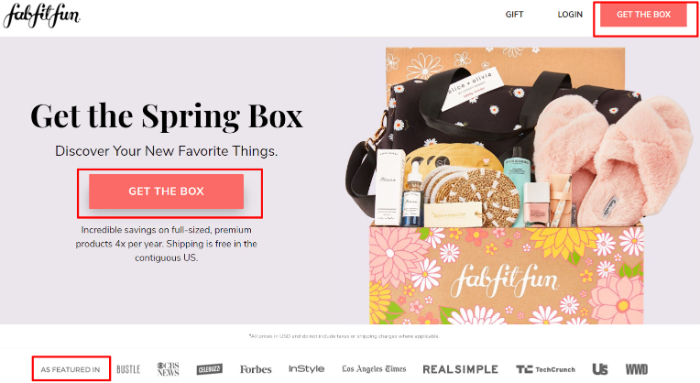
Things that Work Great for FabFitFun’s Landing Page Example
- Color Theme Consistency: The landing page maintains a consistent color theme and doesn’t barge visitors with flashy colors.
- Accurate CTAs: Instead of using generic CTAs like ‘Order Now,’ FabFitFun uses ‘Get The Box’ to accurately describe the desired action.
- Social Proof: The big brands on ‘As Featured In’ column increases the credibility of their product.
- Quick Checkout: The website quickly prompts the visitor to the checkout process as they scroll down the landing page.
- Relevant Design: The landing page design and text resonates a preppy and upbeat vibe to match its target audience’s likes.
- Engaging Visuals: FabFitFun is one of the great landing page examples because it doesn’t clutter its landing page with irrelevant images. Instead of that, it smartly uses visuals that directly compel a visitor to purchase the box.
Lyft – Swift and Smart Conversion
Initially, Lyft was called Zimride. it was launched in 2012 by Logan Green and John Zimmer. When Green saw locals using crowdsourced carpool networks in Zimbabwe, he stumbled across the idea.
With its affordable pricing and driver-friendly outlook, Lyft has emerged as the nice-guy alternative to Uber.
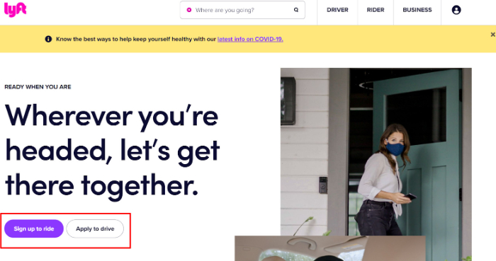
Things that Work Great for Lyft’s Landing Page Example
- Big & Bold Headline: As soon as you visit Lyft’s website, you will see a big heading that describes Lyft’s purpose.
- Images That Build Trust: By showing how both the drivers and the passengers wear masks and follow COVID-19 protocols, Lyft shows how safe the rides are.
- Neat Landing page: Prefers no-nonsense when it comes to big banners. It effectively puts the point across maintaining a simple yet efficient website.
- Quick Conversion: Here is one of the greatest landing page examples you can learn website conversion from because it quickly converts the visitor by placing the signup form right on the top.
- Smart Below the Fold Content: Shows that it cares about the concerns of customers by listing safety-related articles on the landing page. Connecting with and caring for your visitor is a common theme we can see in great landing page examples.
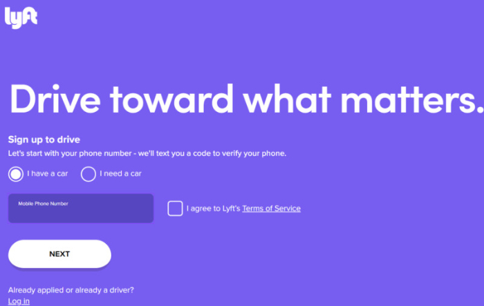
- Efficient Conversion Pathways: The landing page of Lyft speaks to those who would like to make a decision immediately and get more info before signing up. A win-win in both situations.
Causebox – Championing Social Impact
Causebox is a seasonal subscription box service. Two entrepreneurs, Matt Richardson and Brett McCollum, who have a history of starting companies together, started this company as well.
Matt and Brett’s vision with Causebox is to fill the need of having socially responsible subscription-based companies.
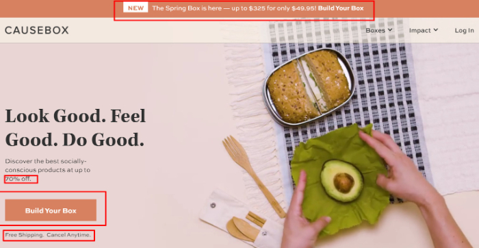
Things that Work Great for Causebox’s Landing Page Example
- Above the Fold Content: The announcement bar does a great job for attracting the attention of visitors and compelling them to buy.
- Clever Copy: Despite the headings being longer than standard norms, they do accurately describe the purpose of the product.
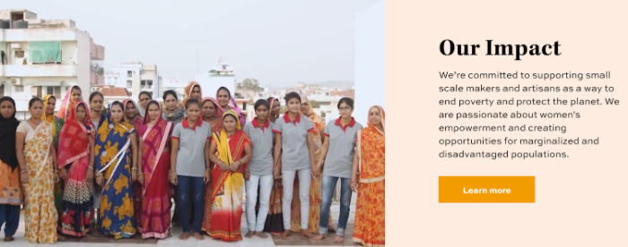
- Product Video Demo: The video on the landing page allows visitors to accurately visualize the product and demonstrates how the product works in action.
- Demonstrating Positive Impact – As the name implies, ‘Causebox’ shows its commitment to creating equitable and empowered societies through its business model.
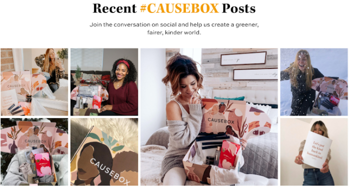
- Social Proof: This landing page example creates credibility by linking Instagram posts of real people enjoying the product.
Home Chef – 1:1 Conversion Guru
In 2013, Pat Vihtelic started Home Chef while partnering with a chef to design delicious and quick recipes. Since then, its growth has skyrocketed. In 2020 itself, Home Chef had delivered over 10 million meals and expanded its delivery service to cover more than 97% of the U.S. population.
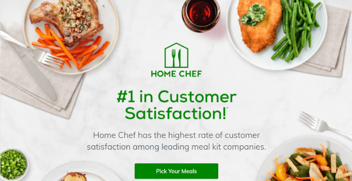
Things that Work Great for Home Chef’s Landing Page Example
- Relevant CTAs: CTA buttons are bright and compelling. Instead of something generic like ‘Order Now’, the CTA is relevant to the purpose.
- Impactful Design: Home Chef is one of the best landing page examples because of how impactful, direct, and uncluttered its design is.
- 1:1 Conversion Ratio: There is one conversion goal and one link. No other link distracts the visitor from the CTA.
- Witty Self-promotion: Adding the ‘#1’ tag to the landing page is a witty thing to do. It instantly builds credibility and doesn’t boast something refutable like ‘#1 in taste’. Since the accolade came from a third-party study, it improves Home Chef’s brand image in the industry.
- Neat Below the Fold Content: The landing page goes on to explain three compelling reasons why a visitor should purchase their product. There’s no fluff seen on the landing page.
- Appetizing Images: Food is a visual product after all. The food that looks good sells well and Home Chef capitalizes on this fact by neatly positioning perfectly-clicked food images.
InfiniteMoon – Visual Marketing Done Right
With more than 10 years of experience in the mattress industry, InfiniteMoon’s founder Steve created natural and customizable pillows and mattresses. The business began in a small warehouse community and has grown massively since then.
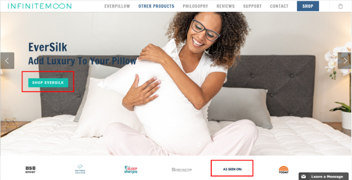
Things that Work Great for InfiniteMoon’s Landing Page Example
- Loaded with CTAs: There are CTAs in every slideshow so that visitors are directed right to the product they’d like to purchase.
- Human Images: InfiniteMoon uses images that resonate with real-life people so that the visitors can imagine themselves using the product.
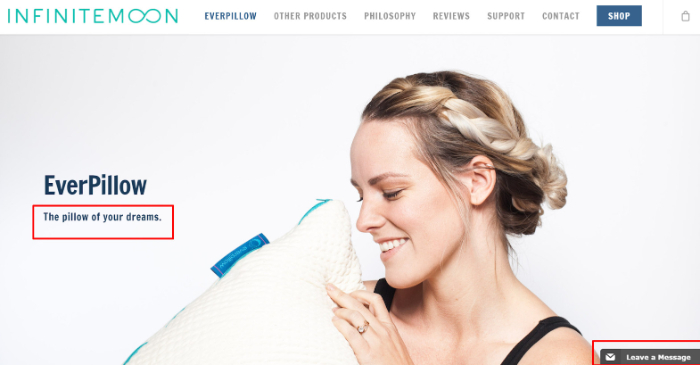
- Great above-the-fold content: They make good use of the space above the fold and throw a punchy tagline for the product.
- Testimonials: Having a designated space for testimonials increases brand credibility and generates enough trust for the customer to press the ‘Buy Now’ button.
- Consistent Theme: The website uses a maximum of 3 colors and maintains homogeneity throughout its posts and texts.
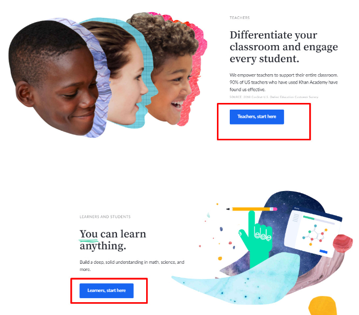
Khan Academy – Neat and Intuitive Interface
Sal Khan started Khan Academy in 2005. He began tutoring his cousins and saw massive scope in using technology for educational purposes. This integration of technology and learning was what set the vision and direction for his non-profit organization – Khan Academy.
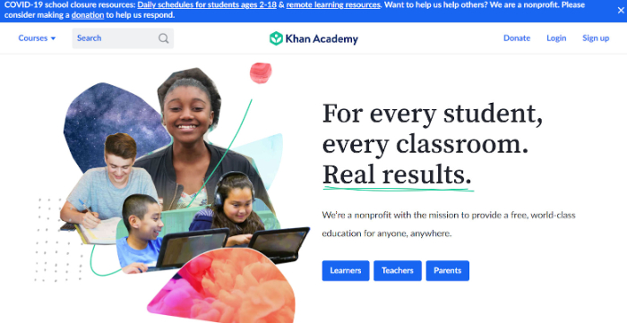
Things that Work Great for Khan Academy’s Landing Page Example
Although Khan Academy is a non-profit organization and doesn’t necessarily work on a conversion-basis, the landing page strategies used by them is something we all can learn from. Khan Academy definitely earns a spot on the list of best landing page examples.
- Clear Message: The landing page offers a complete insight into the main purpose of the organization. The headline smartly conveys its mission.
- Easy navigation: The CTAs are intuitively placed and allows visitors to reach the relevant category without any hassle.
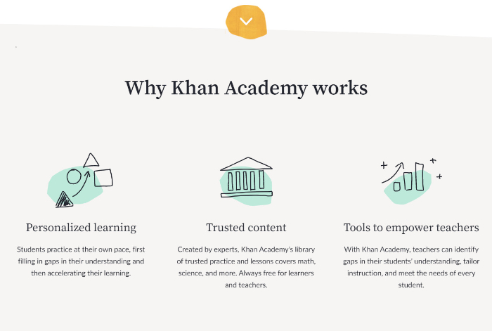
- A Positive Website Outlook: The landing page strikes the perfect balance between an informative and an inviting look.
- Informative Below-the-fold Content: It doesn’t barge first-time visitors with lengthy formulas or equations to look like an educational website. Despite being insanely well-known, Khan Academy still communicates its main objectives to audiences that might not be aware of what it does.
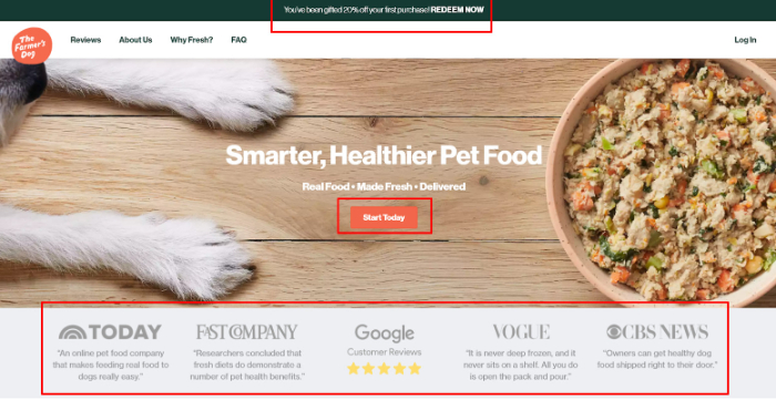
The Farmer’s Dog – Copy That Connects
The Farmer’s Dog is a subscription company that makes fresh and personalized meals for dogs. It was started by Brett Podolsky and Jonathan Regev in 2015 and has amassed $49 million in funding to date.
Things that Work Great for The Farmer’s Dog Landing Page Example
- Captures Visitor’s Attention: The website aims at quick conversions, offering a quick discount to the visitors.
- Accurate Visuals: The banner image easily conveys dog food by having both the image of a dog and pet food.
- Credibility: Logos from top-notch publications and website features generate trust.
- Excellent Copy: The product landing page communicates the quality and care that goes into preparing its products. By mentioning standards and compliances like “Human-grade USDA ingredients” and AAFCO , it asserts its trustworthiness.
- Testimonials & Endorsements: A large range of reviews from vets and pet owners enhance the brand image.
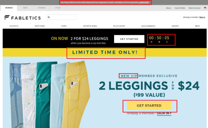
Fabletics – Creates FOMO
Fabletics is an athletics and sportswear brand that was started in 2013. Kate Hudson, Don Ressler, and Adam Goldenberg launched Fabletics after noticing the fact that they may find multiple luxury brands but none would truly cater to the budget of customers.
Things that Work Great for Fabletics Landing Page Example
- FOMO Everywhere: The landing page creates a sense of urgency by positioning a prominent timer and ‘Limited Time Offer’ banner.
- Straightforward Headlines – The landing page’s headline reflects the loud and upbeat brand image that Fabletics holds.
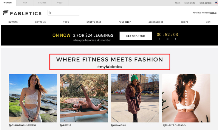
- CTAs: The CTA buttons are bright and attention-grabbing and not coming off as pushy.
- 1:1 Conversion Ratio: Fabletics landing page keeps the visitors focused on offers and doesn’t distract them by other links.
- Short & Effective Copy: Short sentences communicate the purpose and utility of the brand.
Harmless Harvest Organic Water – The Striking Contrast!
Harmless Harvest was started by Justin Guilbert and Douglas Riboud in 2010. Their brand is known for ensuring environmental responsibility. The company produced its first-ever minimally processed organic coconut water and has gained popularity in a decade.
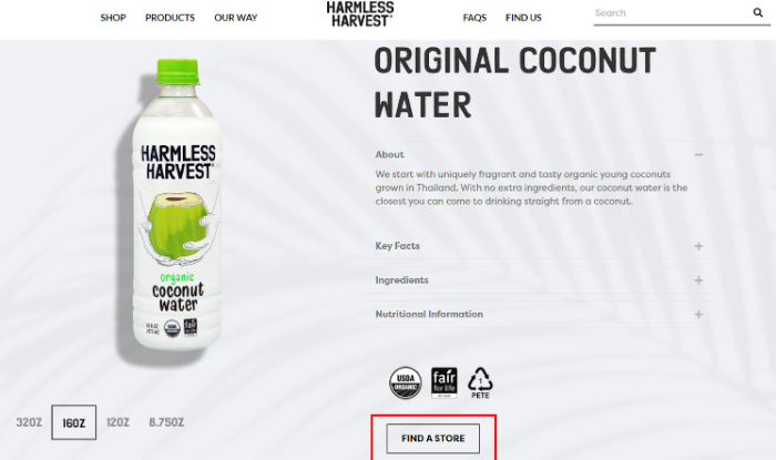
Things that Work Great for Harmless Harvest Organic Water’s Landing Page Example
- Minimalistic Design: The product contrasts against the clean white background, which gives it a prominent look.
- Smooth Navigation: Visitors can easily access information through the neat categories present on Harmless Harvest Organic Water’s landing page.
- Descriptive Copy: The copy maintains a good balance of informative and simple to understand text. The visitors get a good sense of the product qualities and USPs (Unique Selling Proposition)
- FAQs Resolving Questions: FAQs on the landing page demonstrate that the brand cares for its visitors. This is a great way of keeping your visitors engaged and converting them to leads.
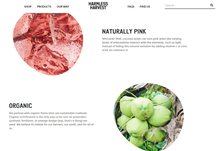
- Compelling Visuals: The photography is on point and gives a vibrant look to the landing page.
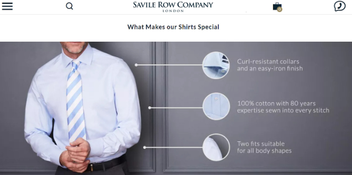
Savile Row Company – The Relaxed Buyer
Savile Row Company was originally established as a physical store in 1998. A few years later, they launched their website and went online. The company has grown to reach customers in over 120 countries and offers a wide range of ready-to-wear garments including men’s shirts, suits, silk ties, and much more.
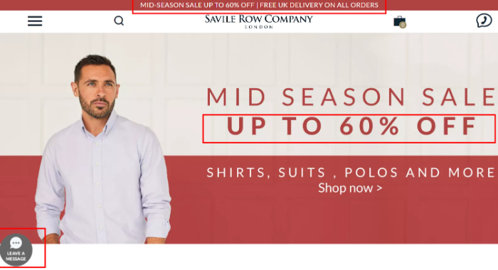
Things that Work Great for Savile Row Company’s Landing Page Example
- Quick Promotion: The store welcomes the visitors with an offer, prompting them to take quick action.
- Short Display of Products: A witty thing to do is to limit the number of products you display on your landing page. People get confused by a range of choices and end up buying nothing.
- Live Chat Function: Live chat function is an essentiality these days. Buyers are filled with questions before making a purchase and the best way to address their concerns is to let them reach out to you. Your customers feel more confident in buying a product from your brand when you maintain a connection with them.
- Use of Visuals for Product Description: Since clothes are a visual product, the best thing to do is to market them accordingly. Savile Row Company leverages this fact and uniquely displays its features.
Lou Electric Skateboard – Standing Out in Style
Lou Electric Skateboard is one of the pioneers of the electric skateboard industry. The business idea was readily welcomed by the public. Let’s see what features make it one of the great product landing page examples.
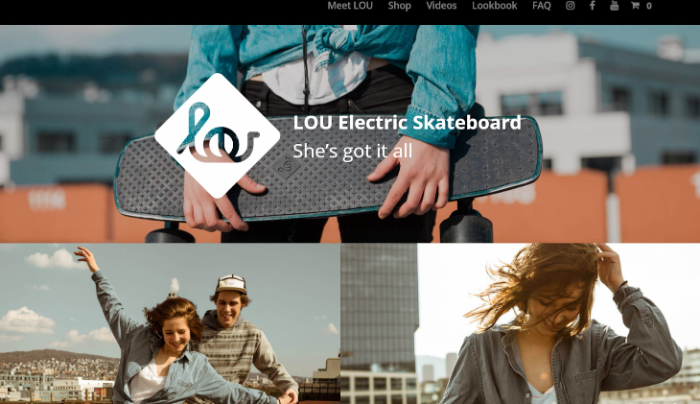
Things that Work Great for Lou Electric Skateboard’s Landing Page Example
- Unique Theme: Lou’s landing page stands out for maintaining a dark theme instead of following the norm of white and simple landing pages.
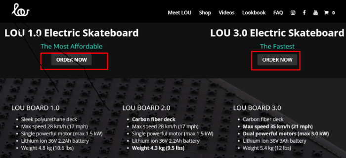
- Good Balance of Text & CTAs: The visitor isn’t overwhelmed by CTAs on every page. Instead, most CTAs are perfectly placed near the product description, making the landing page one of the best landing page examples.
- Endorsed By Big Brands: Mentioning logos of big and popular brands increases Lou Electric Stakeboard’s credibility
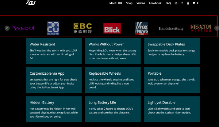
- Structured Product Features: Instead of simply listing down features, Lou creates a grid and presents features in a neat fashion. You can definitely try something like this for your own landing page.
Intercom – Engage Your Visitors
Intercom’s story traces back to a coffee shop meeting in 2011 where four Irish founders came up with an idea of effortless communication. Their first seed round amassed around $1 million in capital from over 15 venture capitalists and key angel investors.
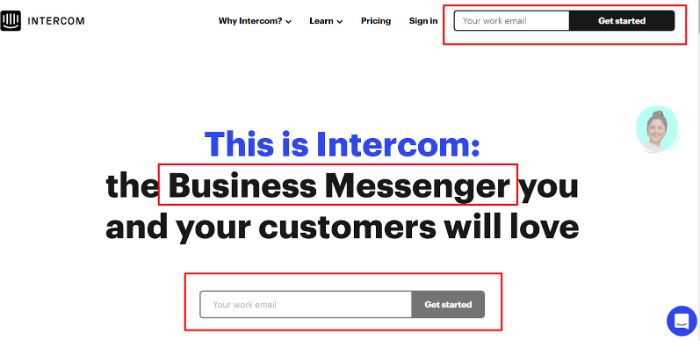
Things that Work Great for Intercom’s Landing Page Example
- Effortless CTAs: The landing page immediately shows up a CTA asking you to input your email. This saves the visitors time and also quickly converts the customer into a lead.
- Vivid Graphics: The entire website is based around customer engagement and interactive visuals that truly captivate the visitor.
- Trendy Copy: Intercom definitely takes the crown when it comes to excellent copy in landing page examples. Look at how succinct it is.
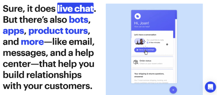
- Live Chat: Well, it’s a no-brainer that a landing page promoting chat features should have a functioning live chat. However, it doesn’t come across as pushy when compared to its competitors.
Final Words
Whether you’re getting started with your online business or are already running one, a landing page can improve your brand value and increase conversions. Make sure to keep your landing pages interactive, concise, visitor-friendly, and distraction-free.
Use the landing page examples provided in this blog post as your compass so that you can get started with designing your unique landing page today!
And by the way, our blog has been mention on best dropshipping magazines on feedpost. We will keep giving you guys the best dropshipping tutorials guides and reviews!