Analyzing Facebook ad examples is the best way to see how powerful and profitable Facebook advertising is. With over a billion active users, Facebook already has your target audiences. All you have to do is reach out to them.
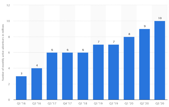
Recently, the number of advertisers using Facebook ads has tripled, reaching an all-time high of 10 million. And guess what? This increasing trend is a great proof of how profitable Facebook ads can be.
In this article, we will see how powerful and feature-packed Facebook ads are. After that, we’re gonna learn what makes it successful for advertising, assessing 15 great ad examples.
Besides, I’ve also added insights on how you can follow similar strategies for your eCommerce store. So let’s begin!
Table of Contents
Features of Facebook Ads
Here’s a quick list that explains the amazing features offered by Facebook Ads:
- Dynamic Ads: Alter according to your customer preferences and behavior. In fact, you can personalize these ads without any manual work.
- Remarketing: With Facebook remarketing, you can reach people who’ve already interacted with or checked out your brand in some way.
- Carousel: Carousel ads can showcase up to 10 images or videos in a single ad, each with different links.
- Collection: Allow customers to discover and purchase products from their phones using Facebook’s visually immersive Instant Experience feature.
- Facebook Pixel: It will automatically track actions on your website and use this data for your paid ads and organic posts.
Now that we have a general idea of Facebook’s capability, let’s dive into 15 great ad examples and see why they stand out.
14 Facebook Ads Examples That Can Give You A Great Idea for Your Store Promotion
Luxy Hair – An Ingenious Ad
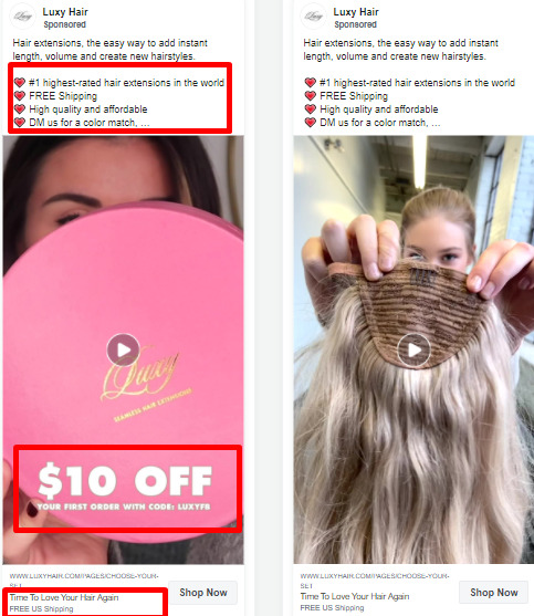
Luxy Hair’s Facebook ad examples are packed with ingenious advertising strategies that we all can learn from.
Ingenious Feature Promotions
The Facebook Ad smartly attracts its visitors offering a 10% discount. It also doesn’t forget to highlight the ‘FREE US Shipping.’
High-Quality Images
First of all, it employs both video and high-quality image styles to grab its audience’s attention. Second, these high-quality images allow the target audience to picture themselves using Luxy Hair’s extensions.
Emotionally Engaging Ad
It also appeals to a visitor’s emotion stating “Time to Love Your Hair Again” as their Call To Action.
Influencer Marketing
Luxy Hair employs influencer marketing strategies and is often seen partnering with multiple influencers to spread the word. Here are Luxy Hair’s influencer Facebook Ad examples in action:
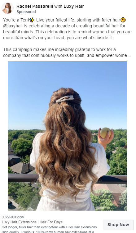
While not every store would have the budget for hiring a celebrity, you can easily work with a social media influencer or micro-influencer for your Facebook Ads. By the way, if you think your friends look like a model, grab a camera and have a photoshoot right away 😉
Sephora – Playful & Informative Ad Copy
Sephora’s ads are a strong blend of playfulness and detailed information.
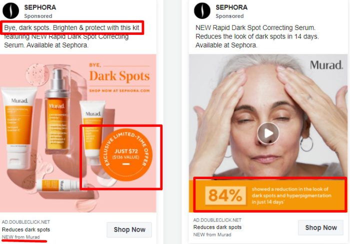
Here are a few things that make Sephora’s ads stand out:
Visually Engaging
Sephora uses bright and bold colors to add a sense of freshness while promoting a new product line. On the other hand, it adds a touch of specificity with some statistics, displaying how effective their serum could be.
Urgency
There’s a sense of urgency with the Exclusive Limited Time Offer and the short & impactful copy for the ad is the cherry on top.
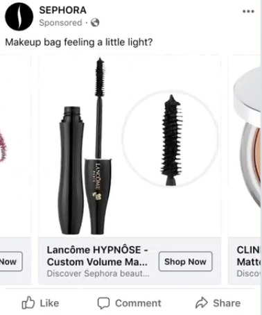
Carousel Ads Used the Right Way
Sephora also uses a Carousel Facebook Ad for promoting its makeup collections. Here’s an example:
The Night Sky – The Environmentalist
Brand Mission And Impact
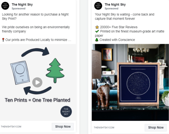
The Night Sky does an amazing job for promoting its commitment to the environment, making it a compelling steal for nature enthusiasts. It uses a small and engaging video to mention its stance and how purchasing Night Sky Prints contribute towards the betterment of the planet in a small yet thoughtful way.
Social Proof
The second Facebook Ad featuring the Night Sky engages its audience in social proof, mentioning how 20,000+ reviewers have loved their product.
Subtle Promotion
It smartly slides in its unique features demonstrating how the product would make for a great gift.
However, the ad could have been better if it could craft a compelling call to action instead of simply dropping in the website link beside the ‘Shop Now’ button.
Meowingtons – The Visual Ad Copy
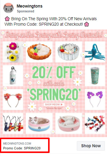
Meowingtons is a popular dropshipping store that caters to cat lovers and offers cat accessories, merch, and much more.
Niche-Tailored Ads
It uses minimal text and drives the viewers attention directly using visuals. The visuals are specially tailored to appear cute and good enough to impress its cat-loving audience, which makes it one of the best niche-tailored Facebook ad examples for dropshippers.
Discounts
It offers a promotion to drive customers to act on the ad. By offering the promo code right on the ad, Meowingtons aims to increase the conversion rates.
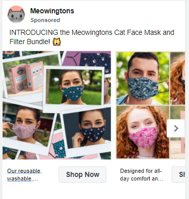
Carousel Ads Done Right
Meowingtons uses the Facebook Ad carousel feature to display its new product line. Besides, the potential customer can get a gist of how the product would look on them.
Snapfish – It’s All About the Brand
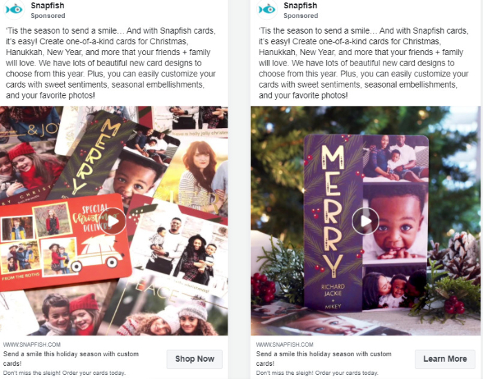
Snapfish maintains brand image consistency in most of its Facebook Ads. This brand consistency leaves an impression on its customers minds, allowing them to remember Snapfish for a longer time.
Seasonal Promotions
Employs videos tactfully and allows visitors to go through a series of festive memories, inspiring them to make the purchase.
Memorable Images
Includes a memorable tone to engage the audience, making it a successful, effective social media advertising example for seasonal promotion.
Balancing Professional And Pushy
Balancing the use of CTAs and adding ‘Learn More’ instead of ‘Shop Now’ – the ad doesn’t appear too pushy and maintains a professional tone.
One aspect that could be further improved is the amount of text used on the ads. Using a short and effective copy, Snapfish’s Facebook ad strategy can better retain visitor’s attention.
Koala – Imaginary & Witty Copy
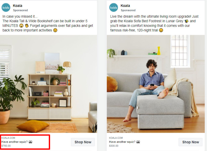
Koala is a furniture brand that uses vivid imagery and witty copy to grab the attention of its visitors.
Engaging Ad Copy
There are multiple emos to keep the reader engaged and gives the ad a very vibrant look. “In case you missed it…” is a great way to start an ad.
Customer-Friendly
Mentioning the prices on the Facebook Ad itself, Koala comes as a transparent and customer-friendly brand. Not only this, it maintains a positive and inviting tone, which is a common thread between most successful Facebook ad examples.
Pour Moi – Bold & Beautiful
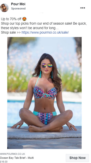
Pour Moi’s ad strategies are strikingly straightforward. First, it’s expresses itself clearly while connecting with its target audience, which is women.
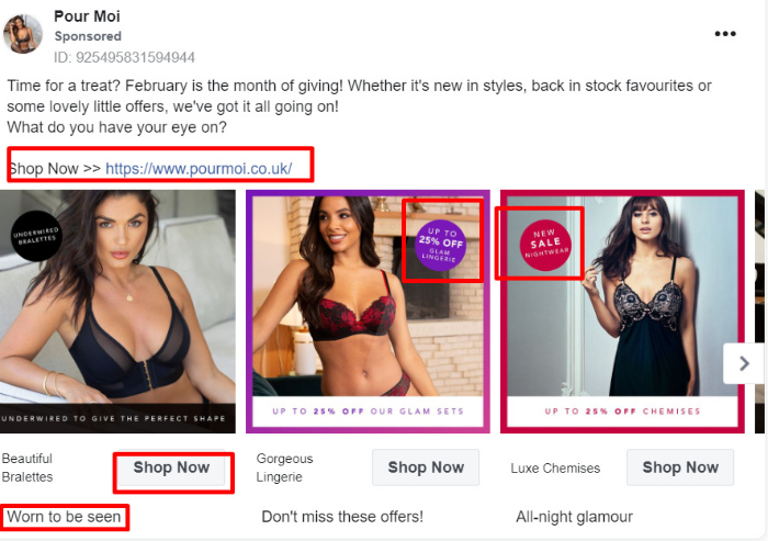
Leveraging Emotions Correctly
It promotes self-love and self-care, both of which form a popular and impactful appeal, leading to nothing but sales.
Discounts to Attract Potential Customers
Next, it appeals to the audience’s pocket and compels them with a 25% off discount and a promo code.
Effective CTA
Finally, it uses short and effective copy as a CTA.
Bombas – Less is More!
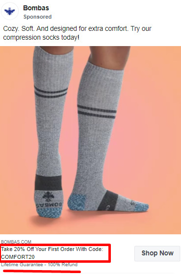
Bombas deserves a spot on the best Facebook Ad Examples 2021 because of its short and actionable ads.
Clear Brand Voice
Bombas’s Facebook ad examples not only deliver the message of why Bombas stands out but also wittingly adds in how durable it is. As you can see, they’re giving away a lifetime guarantee.
Attractive Discounts
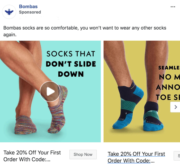
Additionally, their tactic of offering a 20% discount makes the ad viewer pause for a while and consider the offer.
Vivid Imagery
By solely focussing on the feet, the ad imagery and video allow customers to picture these socks on themselves.
Chubbies – Witty Humor Is A Winner
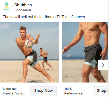
Here’s how short and witty humor steals the game. Chubbies is an excellent Facebook Ad example as it manages to sell itself in an 8-word short sentence.
Humor Done Right
This ad wins support because, unlike Google Search ads where visitors have a very intended search, users on Facebook are not seeking your product while scrolling through their Facebook feeds. This is where pop-culture references can be absolutely effective in ads.
Urgency
Its Facebook ad creates a subtle sense of urgency stating, “sell out faster,” prompting the visitors to shop now.
Leveraging Facebook Ad Templates
Another point to note is that Chubbies maintains a constant ad identity because it repeats many of its Facebook ad templates.
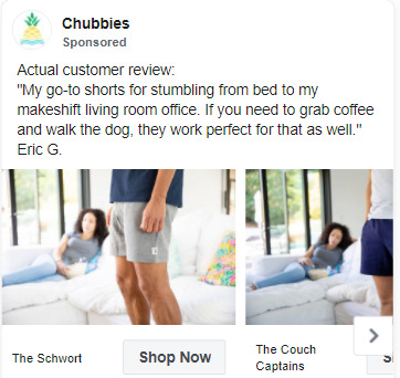
Providing a short customer review, Chubbies provide social proof and fills all the checkboxes for a great Facebook ad example.
- Dollar Shave Club – Killing 2 Birds with 1 Stone
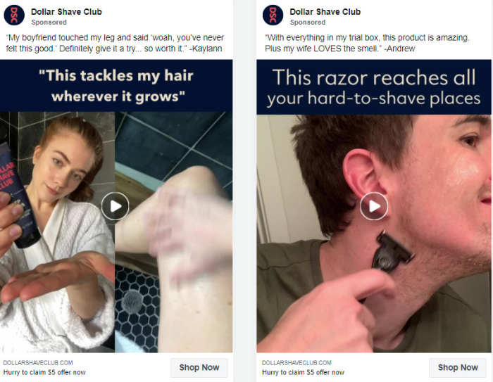
Dollar Shave Club’s Facebook ad pokes fun at other grooming product companies and kills two birds with one stone.
Inclusiveness
The ad copy is aimed at both men and women, which demonstrates Dollar Shave Club as an inclusive brand and shows that it’s not overlooking potentially valuable female audiences.
Strong Brand Image and Social Proof
It leaves a strong and bold impact, providing social proof with those reviews vouching for the product.
Hooking the Viewer for Longer
Dollar Shave Club is one of the great Facebook ad examples that we can learn compelling advertising from. So, the logic behind using a video for Facebook ads is that videos engage the content-seeking and feed-scrolling audiences for a long time. If you hold your visitor for long enough, they might just as well check your store out and make the purchase.
Pat Pat – FOMO At Its Best
Consistent Facebook Ad
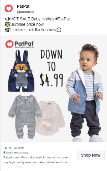
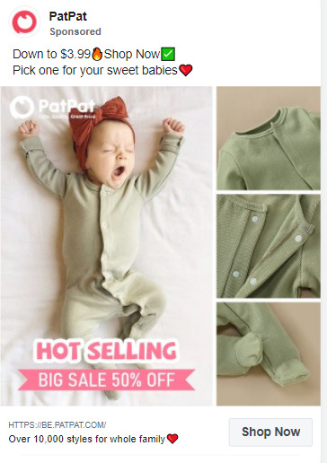
PatPat uses a similar Facebook ad copy template for most of its ads. Maintaining similarity in its Facebook ad outlook creates a consistent image in the minds of its audience.
Urgency and FOMO
The ‘limited stock’ creates the FOMO effect and urges the target audience to act on the ad.
Relevancy
The next point that makes PatPat’s ad one of the great customer-oriented Facebook ad examples is how it positions the product with smart photography. The ad allows parents or target audiences to visualize PatPat’s products on a baby or toddler.
Suzy Shier – The Best Carousel Ad
Carousel And Dynamic Ads
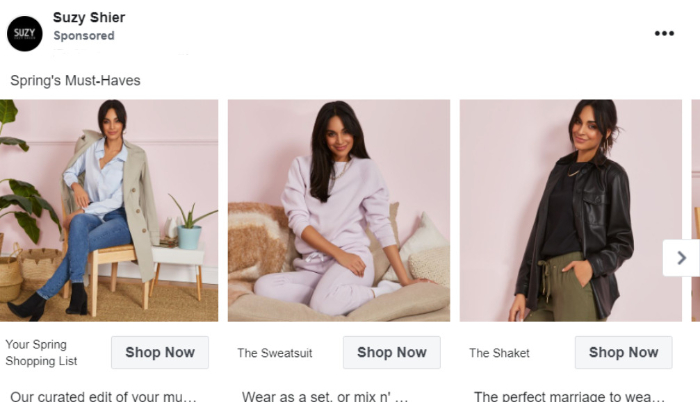
Suzy Shier doesn’t shy away from using carousel ads. After all, Carousel displays are a great Facebook ad strategy to grab your viewer’s attention towards your product line.
Using Facebook Ad Manager the Right Way
As you can see in the above ad, the clothing is of sober and plain colors. Suppose you divide your product line (especially apparel) by colour. In that case, you can easily create a retargeting ad for people who browse by colour and create another ad set in your Facebook ads manager based on this specificity.
Perfect Text to Image Ratio
Since carousel ads tend to be more image intensive, it’s best to keep text to a minimum. By maintaining a great balance of short copy and trendy outfit images, Suzy Shier stands out as one of the great Facebook ads examples that we can learn from.
Kay Jewelers – Tiggers that Awe Emotion
Emotional Appeal
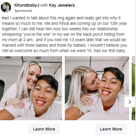
Kay Jewelers taps right into the emotional appeal of its target audience. By advertising real-life stories of customers, this Facebook ad example is a perfect demonstration of how social proof can make ads more relevant.
Personal Touch
Adding a cute and personal touch to the ad, Kay Jeweler doesn’t prompt the viewer to BUY NOW. Instead of this, it uses the Learn More button that directs the viewer to the product page, but without making the ad look too pushy.
Brand Consistency
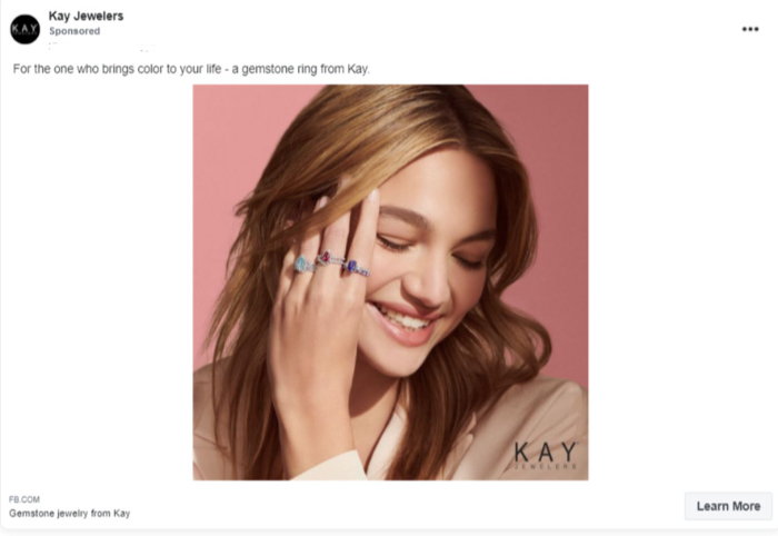
What I like the most about this ad is- it vibes perfectly with the purpose of the store. The image in the above-mentioned picture creates an overall positive and bright vibe, inviting the viewer to remember a person dear to them and imagine gifting them the gemstone ring from Kay Jewelers.
Notebook Therapy – Brand Value Matters
Notebook Therapy is undoubtedly an advertising giant. It’s a great Facebook ads example for dropshippers due to its tremendous popularity over the past few months.
Inviting Ad Videos
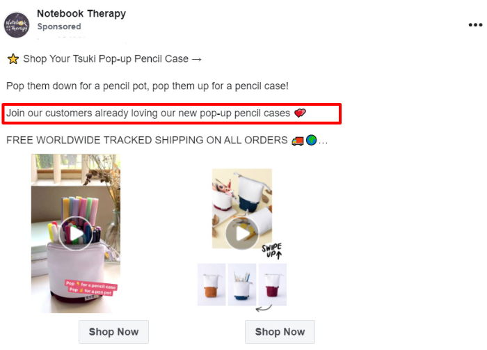
This Facebook ad example stands out for its straightforwardness and inviting look. Notebook Therapy’s Facebook ad is a fusion of cute copy and smart selling.
It makes the target audience smile on its “Pop them down for a pencil pot” while practically explaining how the product works.
Social Proof
It builds trust with the viewer stating how popular the product is amongst customers.
FREE Shipping Hook
Finally, it throws in another attractive offer of FREE shipping to drive those viewers into customers.
Expedia – Catchy And Quality Image
Here’s a remarketing Facebook ad example from Expedia in action.

Remarketing Done Right
I had previously browsed through Expedia’s page to check for a few open hotels despite Covid restrictions. Since I had previously engaged with the page, the ad settings in Expedia’s Facebook Ad Manager got into action and began reaching out to me with ads.
Clever Imagery
There’s a reason behind why this ad stands out. If you look closer at the picture above, 3 different types of landscapes would first catch your attention. The company cleverly shows how it can help me reach my favorite destination with ease.
Final Words
There’s rarely a list without a winner. Let’s see what ads stand out the most in their respective categories.
| Winning Brand | Niche |
| Pour Moi | Appealing Apparel |
| Meowingtons | Dropshipping-friendly Facebook Ads |
| Expedia | The Remarketing Expert |
| The Night Sky | Memorable Gifts |
| Kay Jewelers | Jewelry for Your Special One |
These Facebook ad examples accurately demonstrate that audiences are looking for ads filled with time-killing entertainment, wit, and straightforwardness.
Tapping into Facebook ad strategies outlined in this article, your ads will unlock Facebook’s enormous potential and gain the traction your brand deserves!
