When it comes to a business or a company, there is nothing more necessary than a good eCommerce landing page. A lot of people tend to underestimate the importance of landing pages in eCommerce. However, it is something that, if done right, will take you far in terms of customers and success.
A landing page, is also called the lead capture page. It is a singular page whose goal is to attract and let customers know what they expect from a business.
Everything that you need to turn a visitor into a consumer should be included on the page. Read along to find out what it takes to come up with a good eCommerce landing page. Furthermore, take a look at some of the types, as well as some essential practices to always keep in mind!
Table of Contents
Types Of eCommerce Landing Pages
While the common assumption is that landing pages only follow a particular format and stick to one type, that isn’t the truth.
Today, there are seamless areas and fields to cater to in the market that each one of them needs its own personalization and customizability. For this very reason, every eCommerce landing page is carefully crafted, keeping the audience and purpose in mind.
What’s more, people confuse the eCommerce landing page vs product page and the two couldn’t be more different. The latter does not necessarily consist of a call to action or a goal. They are used to entice the customers and push them towards their decisions. Let us take a look at the four main types to further understand which one is best for you.
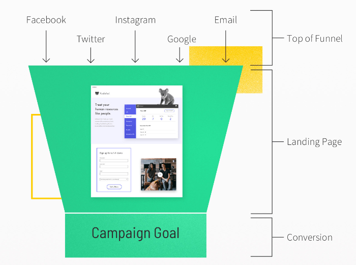
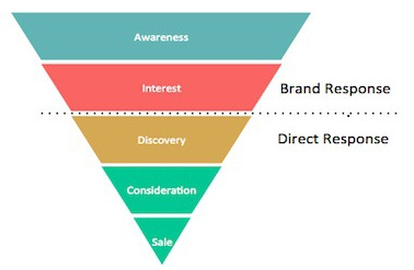
Top of the Funnel Landing Page
Just like the very top of the proverbial funnel, the goal of this landing page is quite straightforward. It is to primarily introduce all of your customers to your products and website.
This eCommerce landing page is best known to work when your potential customers are the same as you. This means they have a similar taste, motive, and preference in mind as your existing customers. This makes it easier to focus on the target audience and what they are interested in further.
One thing that you can say with certainty about these visitors is that they are likely to have a positive response to your products.
The top of a funnel is essentially synonymous with all of the traffic that your landing page sees. All of the people that have just bumped across your website are there because of the awareness you created. Therefore, this section of the funnel eCommerce landing page ensures that this interest is piqued as well as maintained.
When it comes to this section, one thing you should always care about is the simplicity. Indulge in the making of this landing page by remembering that your audience potentially knows very little. Make an attempt to showcase what you do.
Therefore, the first thing to include here is the introduction to you and your company. A little backstory is a perfect way to begin. Next, what people tend to do here is provide basic information about their products. You should also ensure that their company represents legal and social credibility and authenticity.
Mid-Funnel Landing Page
The next popular type of eCommerce landing page targets the people who are in the middle of the funnel. They are, undoubtedly interested in your products and services. But, something is holding them back from going ahead and buying them. This ‘conversion’ becomes rather crucial to ensure, primarily online.
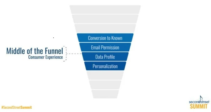
At this point, the call to action needs to be a lot more direct and narrow. For instance, some of the audience might have a few items stored in their shopping carts or wishlist. The catch here is that they may not be that interested in finally going for the same. I believe that the mid-funnel level is something that can make or break you since this finally decides how good your landing page is.
The call to action here should aid in creating a deep sense of pressing urgency and importance. Phrases like ‘Last Chance to Shop!’ or ‘Last Few Pieces Left’ works wonders when it comes to this type of eCommerce landing page. The follow-up campaigns that you carry out here immensely help in building a good relationship with your consumers.
Bottom-Funnel Landing Page
Since we have covered the top and the middle, it is now time to focus at the bottom. Quite similar to the middle, you will have to put in extra effort and work here. This is to ensure that the ‘Buy Now’ button is finally clicked.
Hunting, choosing, and buying a product from a customer’s point of view is an entirely different ordeal. Your job here is to help them get through the same as smoothly and promptly as possible.
Therefore, this section of the eCommerce landing page is for a massive amount of upselling as well as some motivational reminders and retargeting.
If you get this right, one of your most essential factors in sales is instantly taken care of. Ensure to combine hard as well as soft selling. Truly target their emotions if you want them to buy the maximum number of products.
Remember that using discount offers & perks and adding sections such as ‘items frequently bought together’ works wonders here. Focus all of your calls to action on sealing the deal and you are good to go!
Already Purchased Landing Page
Last but not least, the eCommerce landing page is this one. You have now managed to retain and attract quite a few frequent buyers and customers. It is thus time to take things one step forward. This page works to remind the audience that buying from your website will not be a one-time affair.
This landing page is how people are kept happy, satisfied, and coming back for more.
One thing you can skip here is introducing your company, aim, product, etc. This is because people who have reached so far are already familiar with all of those details. Therefore, your target here should be to build a solid and unbreakable foundation of customer loyalty to ensure recurring buying.
For this reason, this type of eCommerce landing page uses different schemes. These include early access, sneak peeks, loyal incentives, and items similar to what they have bought in the future. All of these combined are a great way to remind your customers why they initially chose your brand. It also establishes why they should continue doing so in the future.
Best Practices For Creating eCommerce Landing Pages
I firmly believe that practice makes perfect, especially when it comes to something as crucial as landing pages. To ensure that you are on the right path, some methods could be rather beneficial. These can help make your already existing or brand new landing pages some of the best in the market. These are tips and tricks that some of the most shoppable landing pages follow. Therefore, inculcating these would be pretty beneficial for you in the longer run.
Focus On One Offer
As humans, when you and I are given the option to choose from a variety of different things, each of them can look as appealing as the other. However, the catch here is that having a lot of options can make our decisions all the more complicated. This can lead us to not choose anything at all.
To ensure that this doesn’t happen with your eCommerce landing page, try not to club too many offers together. Essentially, choose the offer that is likely to be selected the most often. The subsequent offer should also bring you the most out of the same. This way, you create for yourself a win-win situation, all the while conveying to the audience that their choice is the best one so far. Therefore, always focus on one offer at a time.
Social Proof
This is one factor that creators of landing pages keep harping on. However, one that also tends to be left out easily. Obliging in this practice will make your eCommerce landing page stand out in competition to several others. It is also a strategy that currently popular pages in the market use.

When your audience is choosing whether to buy a product or not, reading that others have done so previously helps. This can be just the push that they need.
A product that has garnered positive reviews is likely to create quite an impression for itself. To do so, take the help of customer reviews and testimonials. Ensure that they are clearly visible and highlighted on your landing page. This way customers can make use of the same.
Furthermore, celebrity ambassadors, as well as endorsements, can work well in your favor here.
Take the Help of a CTA
Oftentimes, there are too many call-to-actions scattered onto an eCommerce landing page for you to focus on the bigger picture.
To make sure that this does not happen, research thoroughly and decide upon one imperative and critical call to action. This should be what you wish to focus upon more than the others. This is what will be the center of attention frequently.

Find out what is most important to you and your brand and create a call to action around the same. Depending upon several factors, different things might be of topmost priority for your business.
For instance, take your pick from making them aware of new products to encourage them to sign up their friends. Everybody has a different strategy in mind. You must make sure that your primary call to action is directly delivering the same message.
Optimization & User-Friendly Integration
No matter what type of eCommerce landing page you are using to help yourself in the process, always remember this. Users will only stay on the site for as long as they can navigate through it quickly. Once they lose that ease and efficiency, it means that you are likely to lose them fast.

Firstly, keep in mind that your landing pages need to be mobile-friendly too. Most of the traffic that you attract is possibly checking your page out on their smartphones. This means that your job is to make that a good experience.
Work thoroughly upon your optimization and confirm that you keep them interested for as long as possible. Furthermore, make sure that what they want is easily accessible on your eCommerce landing page.
Steady Branding
No matter who your target audience is or what area your product is focused upon, some things don’t change. It is not an unknown fact that you are up against a thousand more companies doing the exact same thing. The catch then is to make your business stand out as much as possible. This is where you need the help of your landing page.
The best way to do so is to direct a lot of your focus onto your design, theme, and aesthetics. It has been scientifically proven that specific colors and fonts tend to work best. Focusing on this will help your customers when it comes to choosing a brand.
Therefore, do not shy away from taking advantage of the same. Your best bet is to focus on unique and liberal color palettes, fonts, mapping, etc. Stick to the original goal and service of your company. Next, align your designs with the same for the best traction.
Research And Analysis
This is a central area in deciding what your eCommerce landing page will look like and attract in the future. As you read along below, you will come across some of the best examples of current landing pages. Similarly, you will also understand why they are doing so well.
Additionally, it is beneficial to do your own research when it comes to practice designs, copies, templates, etc., which has consistently worked well in the past. This, combined with audience research, will give you clear answers as to what your audience is expecting from you.
You can then focus all of your resources and elements on sticking to and delivering those goals. I suggest that you understand your audience and their current needs thoroughly before freezing what your eCommerce landing page will look like.
Top 10 eCommerce Landing Page Examples
Since you are now aware of some of the essentials needed to create a landing page, let us now look at the top 10 pages in the market today. Each of them caters to a different theme, and as we read along, you will also get a deeper insight as to what they’re doing right. Pay great importance to this section since this is what’s going to help you build the perfect landing page. Here are some of the best eCommerce landing pages 2021 has to offer.
MeowBox— Caring and Nurturing of Pets
Who does not like pets? When it comes to this eCommerce landing page, it is a sure-shot way to succeed since this is the kind of theme and strategy that best works with the audience.
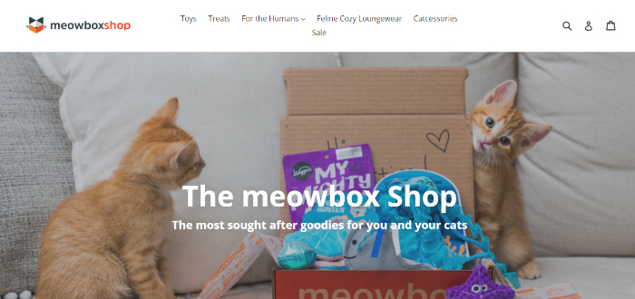
What’s more is that, while it started in 2013 as a small cat subscription box company, the brand has slowly taken over the market due to the particular niche that they are catering to.
What I Loved About The Meowbox Shop?
What I think this brand gets bang on is how they take advantage of the fact that both they and their customers have the same purpose in mind.
Since both the founders and the customers have sincere love for cats driving them, creating the eCommerce landing page becomes extremely easy.
They have made use of direct but straightforward color tones and graphics to convey what they want. Each call to action points to a different section which is backed by credentials.
Scope of Improvement
Perhaps, what this page could have done a tad bit differently is featuring the perks, incentives, and offers somewhere that instantly catches the eye.
As we have understood above, people are mostly driven to make their purchases when they see offers that are not available elsewhere.
One thing that you will see commonly practiced across a lot of landing page examples is an attempt to rope people in through exciting schemes. Therefore, do keep in mind to practice that with your eCommerce landing page.
Lastly, this theme works best if you wish to drive a point home with the support of emotions and know precisely the kind of audience that you want to attract.
Vanity Planet— Smooth Cosmetics and Skincare
Having started in 2014, Vanity Planet uses a beautiful pink, blue, and white layout to ensure that the traffic and traction they are looking for are served exactly what they are looking for. The website is extremely simple to navigate through and gains total points for using the correct theme and design to do justice to their products.
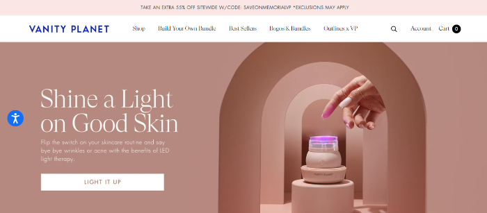
Vanity Planet is a leading name when it comes to healthy skin care and beauty products that a distinctive audience can enjoy.
What I Loved About Vanity Planet?
One thing I loved wholeheartedly about this eCommerce landing page is the way they have managed to keep all of their headings short, simple, and to the point. The main features that they focus upon are large-sized and detailed pictures, which seem to be working quite spectacularly for them.
Scope of Improvement
One pertinent issue that this landing page could perhaps work upon is changing the lack of call to action that is noticeable right on the main page. Through this, they could truly direct the people at a specific level of the funnel towards a particular purpose.
When making your own landing page, make sure to rely heavily on the call to action.
All in all, this landing page works due to its sophisticated nature, clear-cut purpose, as well as the popular Facial Cleansing Blush they are selling to their customers.
Ermenegildo Zegna— Selective Luxury Fabrics
All those people who have a fine eye for clothing and are interested in purchasing premium fabrics must have heard of this brand. While their eCommerce landing page previously catered to only materials, they now dabble in luxury menswear that is taking the market by storm.
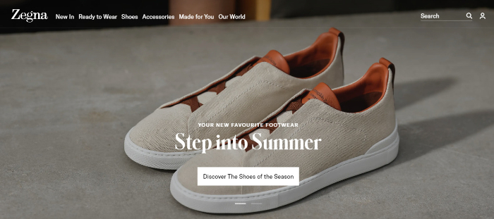
What’s more is that a lot of individuals today are looking to splurge upon customized service and this serves that purpose brilliantly.
What I Loved About Ermenegildo Zenga?
One thing that a lot of landing pages fall short of is the delivery aspect. If you aren’t genuinely describing and endorsing your product on your landing page, you are essentially doing something wrong.
However, this is what Ermenegildo Zegna does just right. Since they know who their target audience is, they have used the necessary elements to get them to shop for their products. This includes a compelling call to action as well as the provision of well-established customer service.
Scope of Improvement
As discussed in the best practices for eCommerce landing pages, it is severely ineffective to portray or showcase too many things at once.
Their website does just that, with the section headers clamped up together, making it difficult for the visitors to feel like they have the space to make a choice. Working upon this could truly change things for the better.
For people who are particularly fond of personally tailored fabrics and fits, their customer service and the way they advertise the same will undoubtedly be thoroughly appealing.
Troubadour— Sophisticated Bags
This is an industry that quite a few businesses are yet to capture beautifully and Troubadour does just that. Started by two friends, they tell their story quite wonderfully and are now successfully selling totes, duffles, shoulder bags, wallets, briefcases, etc. for both men and women.
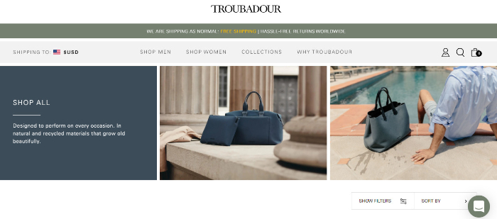
They have established their brand name to be synonymous with an outstanding style statement.
What I Loved About Troubadour?
One of the key points I touched upon when talking about good practices that eCommerce landing pages should follow was the need to tell their own story.
Both the founders do this brilliantly and also display their purpose for starting this venture on their landing page.
This shows the customers how thoroughly invested the brand is in satisfying them, which definitely becomes a beneficial factor.
Scope of Improvement
While they did everything else right, perhaps the call to action here does not directly link to their purpose in mind. Since Troubadour already exhibits most of the products on the main landing page, the call to action could have been tweaked, keeping in mind what they wish to achieve.
Therefore, ensure that your call to action is not arbitrary and far away from your true goal.
If you are a man interested in sophisticated bags or want to gift something to your significant other, this is the perfect place to do that in style.
Doodly— Attractive Video Content
Today, everybody in the world needs video content to serve their companies and brands, and doodly does just that. Founded back in 2002 by an energetic and determined CEO, Doodly has undoubtedly created the perfect eCommerce landing page to help them turn visitors into buyers permanently.
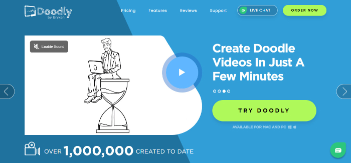
Using it is essentially extremely simple, and it comes with several different plans too.
What I Loved About Doodly?
One thing that Doodly deserves immense credit for is to showcase all of their talent, specifications, and features that they provide on the landing page. The visitors are never left in doubt as to what exactly it is that Doodly does. Furthermore, it also has obvious CTA’s and all of the information about the brand one could possibly need. Other than this, they have a video on the landing page too!
Scope of Improvement
While their logo follows a similar color scheme, perhaps a slightly different color palette could further help bring out the areas and sections that they wish to focus upon.
Always ensure that you are putting in enough research before finalizing the design of your eCommerce landing page.
Doodly teaches us how to provide the customers with everything they are looking for to clear all of their initial doubts and make the landing page as interactive as possible.
Divi— Interesting Templates
While there are not a lot of WordPress eCommerce landing pages in the market, Divi is one name that outsmarts them all. Owned by Elegant Themes, it is a plug-in and theme specialist that helps you design your own website and landing page.
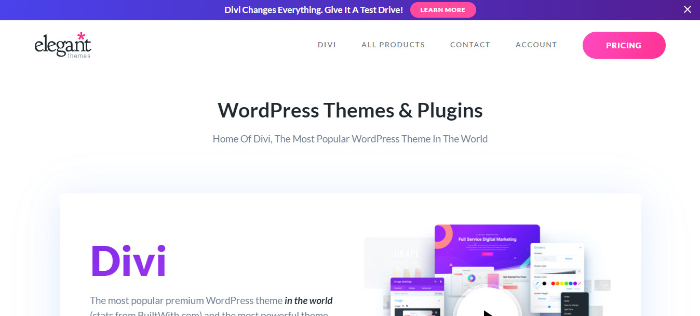
They do so by providing hundreds of readymade templates for their users.
What I Loved About Divi?
One thing that is genuinely commendable about their landing page is the ability to drive the focus on what is important.
For instance, we are greeted with some of the top templates they have to offer, as well as a range of options that are potentially important.
The intricate search option, as well as the big, bold pricing button, is a great way to focus on the things that matter.
Scope of Improvement
One thing that Divi can inculcate is client testimonials, reviews, and legal certificates to substantiate its brand image.
Doing so would allow the customers to put their confidence and trust into this website and perhaps also use their services more than once.
In a world where everything is changing, Divi still makes beautiful use of WordPress and adds a unique edge and value to the templates they offer on their eCommerce landing page.
Thistle – Healthy Meals and Nutrition
Founded in 2013, Thistle allows users to always stick to their calorie limit while also enjoying some flavorful and tasty food. Their founders are firm supporters of sustainability and nutrition, and all of their meals are environmentally friendly and real whole foods.
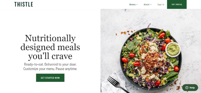
Their landing page too does a wonderful job of promoting the same.
What I Loved About Thistle?
Since we have been harping on how imperative incentives and offers are, let us take a look at how wonderfully Thistle makes use of the same.
Their eCommerce landing page includes several pop-ups that come with discounts as well as the perfect call to actions to back up the same. This means that it does not take long to build customer loyalty.
Scope of Improvement
Sometimes, landing pages can tend to get a little too informational. This can lead to the readers quickly losing interest and moving onto a landing page that is a lot easier and simpler to understand.
One thing that you should keep in mind is making your page as optimized and reader-friendly as possible.
Overall, Thistle will serve people extremely well and is a brand that is to be quite valuable in the future. If you are looking for some creative inspiration, be sure to visit this landing page.
WaterDrop— Flavored Capsules for Water
This is probably something quite unheard of but also something that they have carved a niche in. By reminding people why drinking water is so important, they also aim to take things one step further.
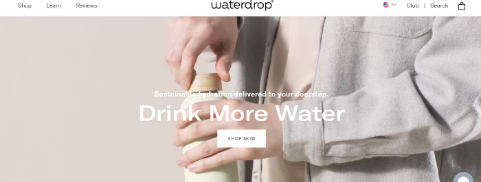
The company and the eCommerce landing page aim to sell capsules to enhance the flavor of the water people are buying.
What I Loved About WaterDrop?
There is not one, but quite a few things I loved about WaterDrop. The first thing you see on the landing page is an extremely cool graphic, which is quite visually appealing.
They provide statistics of their previous customers, as well as carefully curated calls to action to ensure that their visitors are following the right trajectory.
Furthermore, they even have links to their social media for added assurance.
Scope of Improvement
Since they are doing so well in establishing a customer base and building loyalty, one thing that can truly drive their point home is a personal and raw video.
This can help turn things around for the better and give them the added touch that they need.
Simply put, this is quite an intriguing field and line, and WaterDrop makes use of all the right tools for their landing page to become successful.
Infinite Moon— For Better Sleep
Infinite Moon was started with the goal of helping individuals sleep more peacefully by making everyday use products a lot more comfortable.
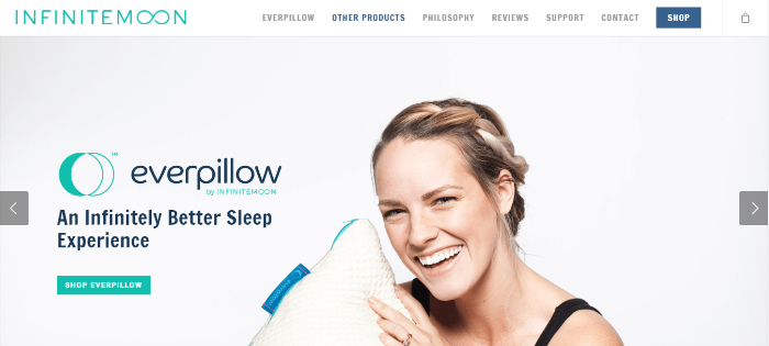
While their key focus is on their high-selling and popular pillow, they also specialize in sheets, satins, silks, etc.
What I Loved About Infinite Moon?
When you get to the eCommerce landing page, you are greeted with jovial pictures of customers who are clearly sleeping better with the help of their products.
This, combined with several credentials as well as a team that helps decide which product is right for you, truly shows their dedication towards new visitors.
Along with this, they have also come up with quizzes and scientific evidence to back their products.
Scope of Improvement
While they have clear sections and headers to guide their consumers, the product names are pretty vague and unclear.
Providing absolute certainty regarding what they are selling should always be one of the key things to include in a landing page.
They are here for a good cause and aim to alleviate the sleeping patterns and lifestyles of individuals. Their landing page conveys this quite well!
Winc— Curated Wines
This eCommerce landing page is the perfect example of how to indulge and interact with the bottom of the funnel visitors. They are a brand that focuses on making great wine, as well as providing some top-tier curations and recommendations to help you choose.
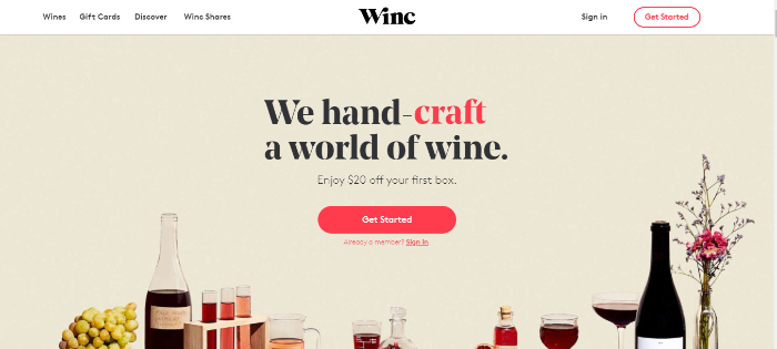
Founded in 2012, the entrepreneurs came forward with the mission of making wine more accessible.
What I Loved About Winc?
While they have a brilliant layout and design, they also make use of a witty and intriguing quiz to better understand the kind of wine that one would need. Furthermore, the call to action is perfect for inciting interest and allowing the customers to look forward to what is coming next.
Scope of Improvement
One key area of this eCommerce landing page that needs to be worked upon is testimonials. Especially since they sell and curate the best-quality wines, customer reviews could largely help in finally giving potential customers that push needed.
There are not a lot of brands that are so truly committed to their cause and Winc is one of them. Hence, keep in mind to check their page out for some great bottom of funnel inspiration.
The Bottom Line
Congratulations! You have come so far in the journey of landing pages. As you must have noticed above, creating a perfect page is quite a bit of hard work.
Whenever you are stuck, ensure to refer back to some of the best practices, as well as to look at several brilliant examples. A great eCommerce landing page is essentially just what you need to direct all of your visitors exactly where you want them. Choose a type you like and then design it in your own unique way!